Creating a RWD display combo
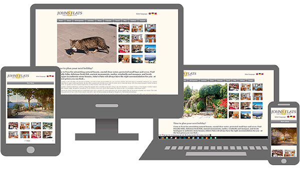
You have seen them, haven't you? These images indicating that a website can adapt to all screen sizes. You may have wondered how to make your own, with images of your own site, or the site of a client.
This is not a component, it is actually not dependent on any particular web site builder (I'm just using SD3 to make this site). What you need is an image editing programme, like Photoshop or some other programme which can work with layers.
In the Download zip file you will find master images to show what sizes you need, the frame that you can put those images into, and for those who are Photoshop users I've included the .psd file for the image above.
The master files are larger than you are likely to want on a website. But it's easier to work with those larger images, and when done, you just make the merged file smaller, to fit your needs.
It's important to work from back to front, putting the laptop size image on the bottom layer, then the desktop one, and finally the two small images. The finished image has to be merged and then saved to a .png file with a transparent background, so that you can place it on any other coloured background.