Some easy to create, simple cards. Again I have used the source from materializecss.com, but also gleaned over to the resources issued by CC. Materialize has separate cleasses for small, medium and large cards, but I didn't use them, as they among other things have a defined height (like e.g. 300px height for the small ones). Instead I just used the class 'card', and let the contents decide the height. You've got more freedom that way. The width can be set as you wish.
The 'card-list' can be filled with as many cards you want. Duplicate or delete the class 'card' if necessary. Make a component by selecting the 'card-wrapper'.
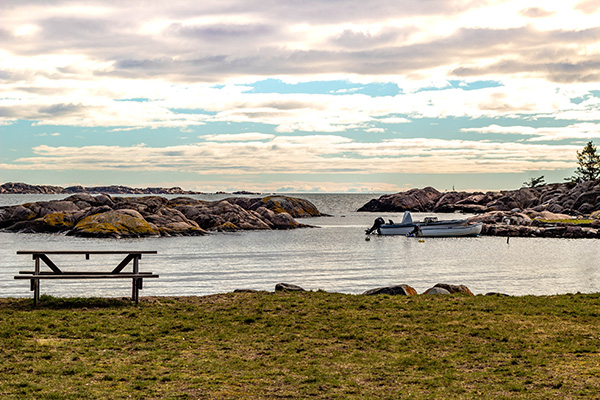
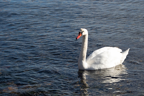
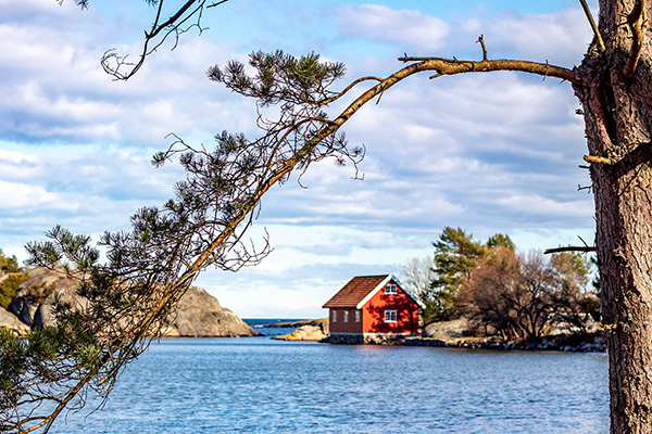
(The images were taken today, March 18th 2019, which was a very nice and warm spring day down at the coast near Arendal in Southern Norway.)
card title
Lorem ipsum dolor sit amet, consectetur adipiscing elit. Maecenas et metus.
Some easy to create, simple cards. Again I have used the source from materializecss.com, but also gleaned over to the resources issued by CC. Materialize has separate cleasses for small, medium and large cards, but I didn't use them, as they among other things have a defined height (like e.g. 300px height for the small ones). Instead I just used the class 'card', and let the contents decide the height. You've got more freedom that way. The width can be set as you wish.
The 'card-list' can be filled with as many cards you want. Duplicate or delete the class 'card' if necessary. Make a component by selecting the 'card-wrapper'.
(The images were taken today, March 18th 2019, which was a very nice and warm spring day down at the coast near Arendal in Southern Norway.)