Grid Gallery, Bootstrap
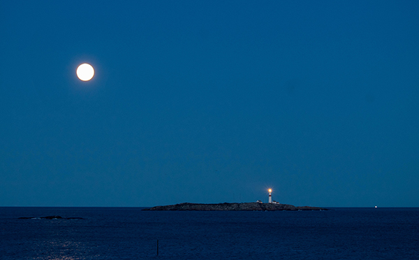
Here is a simple CSS grid picture gallery. It is based on a fall-back for older browsers, made with a single column of images, each in their own holding container. As the viewport widens, this column gets split up in two or three.
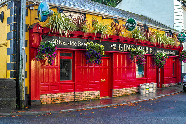
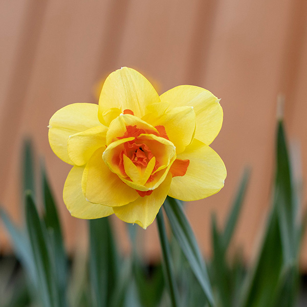
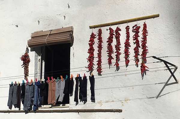
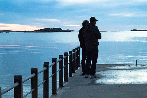
At the 2nd breakpoint it is turned over to grid, and the images with the holding containers are positioned into the grid cells. Due to the images having different sizes and shapes, it takes a bit of fiddling to find the best place for them.
A CSS grid can have a maximum of 12 by 12 cells. If more is needed, grids can be nested, but that will make each cell so tiny that it may be impossible to view the content at some viewports. A better solution might be to create more galleries.
Creating a component can be done by selecting the .gallery container. But using the same setup as here, will be hard because of different proportions of your own images. So this gallery will serve as a starting point, giving you some ideas, showing what to do, and which settings will be needed, and then every user will have to fit his/her own images into the grid.
As usual, I ask you to remove my images, also from your resources, and then use your own pictures.
Please be aware that you need at least SD4.0 to be able to open this .rsd file.
